

Implementing Light and Dark Mode in Multi-Page NextJS App using TailwindCSS

In any modern website , you will definitely notice the option to change the current theme. And if you are a developer, you will most likely to use the dark mode (though I prefer the light mode sometimes). So in this tutorial, first we will try to implement it in plain React since in an interview they might not give you the option to use TailwindCSS and Next, and simply hand you a react codesandbox. I recommend not skipping this since the foundation of the working will be laid down here so that later we can focus less on the working and more on code.
We will not cut corners and implement theme toggler in a multi-page website cause hey building it in a single page website is something which can be easily done using useState and its not quite interview material.
Implementing Theme Switcher in React
Setting up the project
We will be using Vite to install react since create-react-app takes a lot of time. I will be using VSCode as my code editor , you are free to use your own. Run this command in the terminal:
npm create vite@latest name_you_want_to_give_for_app
After that a selection will appear, where you will be asked what framework to use. Here you will select React. After that you will be asked what variant to use, since I am keeping it for beginners lets use Javascript and not Typescript. After that your starter react project will be initiated.
Then move to your project using:
cd name_you_gave_to_your_app
Or what I suggest is go there manually using your editor.
Then install the dependencies:
npm install
And run the app on local server:
npm run dev
You will be shown a message that your app is available on http://localhost:5173. Now the port number can be different so make sure to check it on your end.
Lets visit the site:
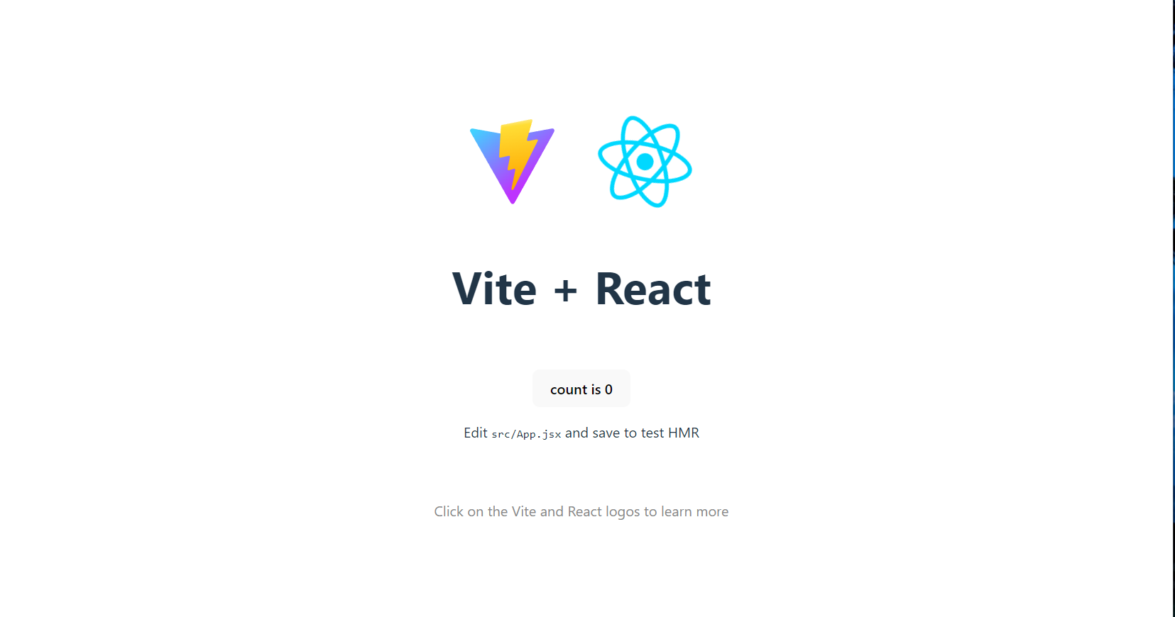
It looks something like this , but soon it will not (no need to take it negatively).
Lets get started with the real deal
Lets have a look inside src folder. Now lets clean App.css and index.css since we are trying to build it from scratch.
I have kept index.css initially like this so that there is no extra default padding and also the font looks good:
*{
  padding:0;
  margin:0;
  font-family: Inter, system-ui, Avenir, Helvetica, Arial, sans-serif;
  line-height: 1.5;
  font-weight: 400;
  font-synthesis: none;
  text-rendering: optimizeLegibility;
  -webkit-font-smoothing: antialiased;
  -moz-osx-font-smoothing: grayscale;
}
Now there are few things which we will need to consider. We are trying to build a multi page demo. You might have seen once you change the theme , the theme is maintained for the other pages of the website and it only changes when you change it again. We will need to show that feature as well if we want to impress the interviewer. So for that we will be using an external dependency react-router-dom and then have a Navbar component (having the links) which will be retained in all the pages and the pages would be Home, About and Help. We will build separate components for them. Don't worry and lets just take it slowly.
Firstly install react-router-dom:
npm i react-router-dom
Now clean up the App.jsx file and make these changes:
import { BrowserRouter, Route, Routes } from 'react-router-dom'
import './App.css'
import Navbar from './components/Navbar'
import Home from './components/Home'
import Help from './components/Help'
import About from './components/About'

function App() {

  return (
    <>
      <Navbar />
      <BrowserRouter>
        <Routes>
          <Route path="/" element={<Home />} />
          <Route path="/help" element={<Help />} />
          <Route path="/about" element={<About />} />
        </Routes>
      </BrowserRouter>
    </>
  )
}

export default App
You will notice that there is a Navbar component being used which is a constant for all pages and then there are the respective components for respective pages. Lets have a look at them one by one:
Navbar.jsx
import React from 'react'
import { Link } from 'react-router-dom'

const Navbar = () => {
  return (
      <div className="navbar" style={{
          display: "flex",
          height: "5vh",
          alignItems: "center",
          justifyContent: "center",
          fontSize:"20px",
          gap:"20px"
      }}>
          <Link to="/" style={{textDecoration:"none"}}>Home</Link>
          <Link to="/help" style={{textDecoration:"none"}}>Help</Link>
          <Link to="/about"style={{textDecoration:"none"}}>About</Link>
      </div>
  )
}

export default Navbar
For the rest of page components, I have used a template component which will be used in all of them, I just simply send the page name as prop and have it dynamically displayed.
Template.jsx
import React from 'react'

const Template = ({pagename}) => {
  return (
    <div className="main" style={{
        height: "95vh",
        display: "flex",
        justifyContent: "center",
        alignItems:"center"
      }}>
        <div className="toggler" style={{
          display: "flex",
          flexDirection: "column",
          alignItems:"center",
          gap:"2vh"
        }}>
          <div style={{
            fontSize: "5vw",
            display: "flex",
            gap:"2vw"
              }}>This is <span style={{ color: "#9434ec" }}>{pagename}</span> Page
          </div>
          <button style={{
            padding: "10px 20px",
            backgroundColor: "#9434ec",
            color: "white",
            fontSize: "20px",
            border: "none",
            borderRadius: "10px",
            cursor:"pointer"
          }}>Toggler</button>
        </div>
      </div>
  )
}

export default Template
And here are the page components:
Home.jsx
import React from 'react'
import Template from './Template'

const Home = () => {
  return (
    <Template pagename="Home"/>
  )
}

export default Home
About.jsx
import React from 'react'
import Template from './Template'

const About = () => {
  return (
    <Template pagename="About"/>
  )
}

export default About
Help.jsx
import React from 'react'
import Template from './Template'

const Help = () => {
  return (
    <Template pagename="Help"/>
  )
}

export default Help
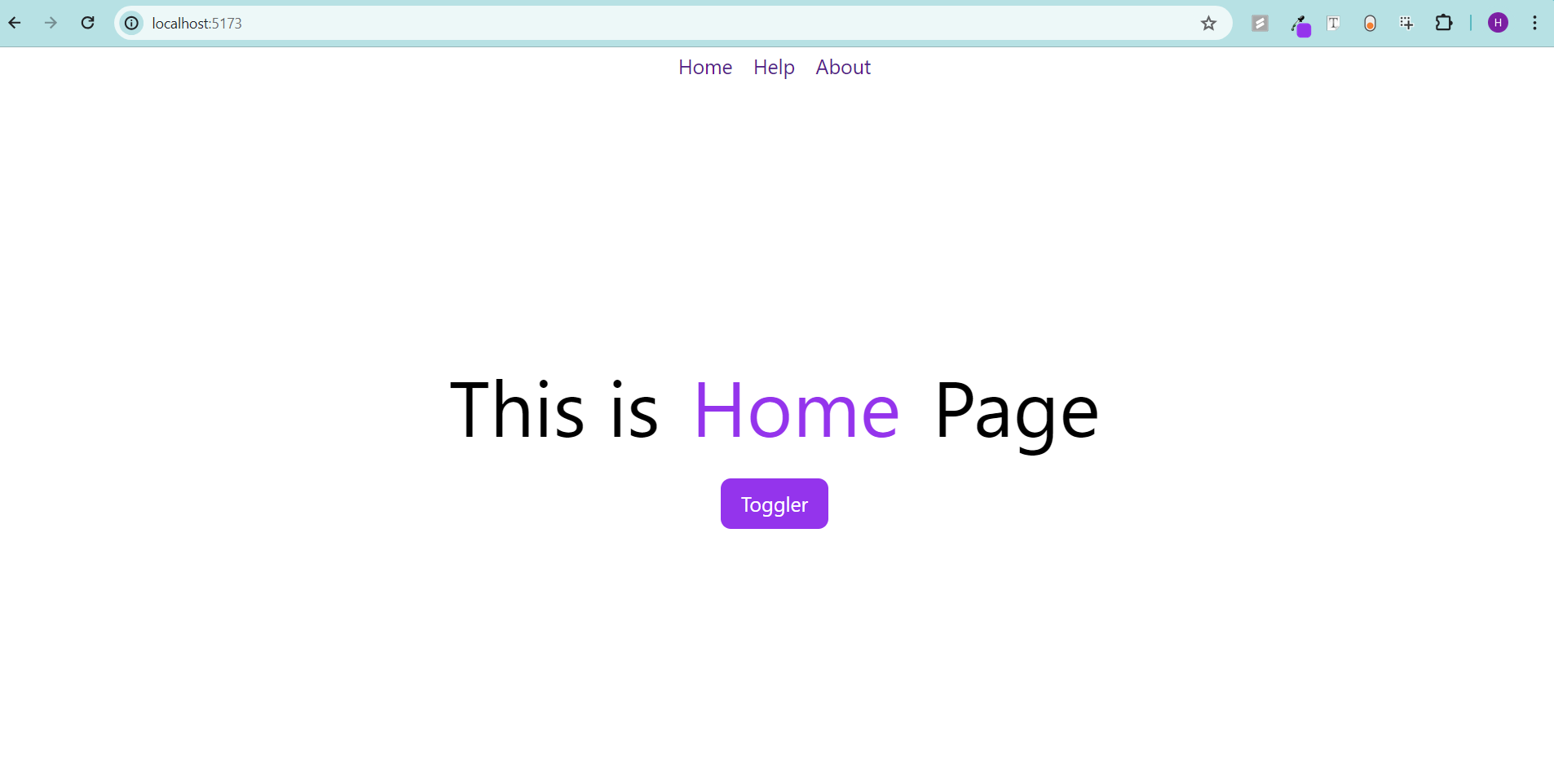
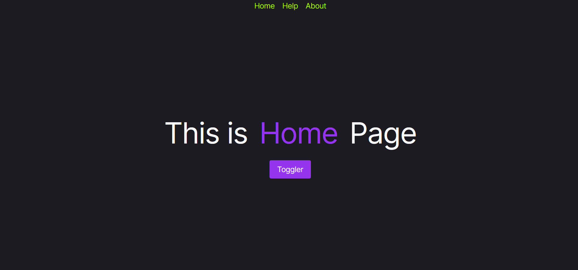
Currently your home page should be looking like this:
If you understand basic React, you should be good. Next we are going to have some curveballs coming.
Using Context API
The Problem: now what we can possbily do? Maybe introduce a state in each component to keep in check the mode the user has toggled using the button but how does the other component know what is the last value the equivalent state had in the other component before page was changed?
The Solution: maybe we can prop drill a high level state and its setter function so that all the components are affected when the state gets changed in one component , it gets retained since it is sent from the parent. Or, we can also use local storage and use useEffect at initial load to change the local state. But the best way is to either use react redux or use the Context API.
Here since we don't need that much complexity , we can use Context API. Lets get this done step by step.
First create a separate file for context related stuff , lets say context.js and have a look at this:
import { createContext, useContext, useState } from "react";

const ThemeContext = createContext();//this creates a context

//next lets create and export a custom hook which will return the context
//value to the caller
export const useTheme = () => {
    return useContext(ThemeContext);//useContext(someContext) basically
    //helps in consuming the value of the context or simply put returns
    //context value respective to the someContext
}

export const ThemeProvider = ({ children }) => {

    //state to remember the mode
    const [isDarkMode, setIsDarkMode] = useState(true);

    //func to change the mode
    const toggleTheme = () => {
        setIsDarkMode(!isDarkMode);
    }

    //next you will see we will be wrapping the components under the
    //Provider so that the value passed to it as value prop can be
    //consumed inside the components using useContext
    return (
        <ThemeContext.Provider value={{isDarkMode,toggleTheme}}>
            {children}
        </ThemeContext.Provider>
    )
}
If you find any difficulty, make sure to read about useContext docs on react.dev .
Now we wrap the JSX of App.jsx with ThemeProvider so that the context is made available from the top level to all the components.
import { BrowserRouter, Route, Routes } from 'react-router-dom'
import './App.css'
import Navbar from './components/Navbar'
import Home from './components/Home'
import Help from './components/Help'
import About from './components/About'
import { ThemeProvider } from './context'

function App() {

  return (
    <ThemeProvider>
      <Navbar />
      <BrowserRouter>
        <Routes>
        <Route path="/" element={<Home />} />
        <Route path="/help" element={<Help />} />
          <Route path="/about" element={<About />} />
          </Routes>
      </BrowserRouter>
    </ThemeProvider>
  )
}

export default App
Okay , the worst is over. We have set up the context , now we just need to consume the value, allow toggling and switch styles accordingly.
Using Data Attribute for CSS Switching
You can have a look at what data attribute means but simply put it is simply an attribute with a value associated with the document. In the ThemeProvider component inside context.js , we will simply add an useEffect whose work will be to change the attribute value to the theme name whenever inside any component , the mode is toggled.
export const ThemeProvider = ({ children }) => {

    //state to remember the mode
    const [isDarkMode, setIsDarkMode] = useState(true);

    //func to change the mode
    const toggleTheme = () => {
        setIsDarkMode(!isDarkMode);
    }

    const theme = isDarkMode ? "dark" : "light";

    //here useEffect is used to change the data attribute associated with
    //the document so that based on the data attribute we can switch css
    useEffect(() => {
        console.log(isDarkMode)
        document.documentElement.setAttribute("data-theme",theme);
    }, [isDarkMode]);

    //next you will see we will be wrapping the components under the
    //Provider so that the value passed to it can be consumed inside the
    //components using useContext
    return (
        <ThemeContext.Provider value={{theme,toggleTheme}}>
            {children}
        </ThemeContext.Provider>
    )
}
Now lets add some CSS in index.css
*{
  padding:0;
  margin:0;
  font-family: Inter, system-ui, Avenir, Helvetica, Arial, sans-serif;
  line-height: 1.5;
  font-weight: 400;
  font-synthesis: none;
  text-rendering: optimizeLegibility;
  -webkit-font-smoothing: antialiased;
  -moz-osx-font-smoothing: grayscale;
}

[data-theme="light"]{
  --bg-color:white;
  --text-color:black;
}

[data-theme="dark"]{
  --bg-color:black;
  --text-color:white;

  a{
    color:#a6ff00;
  }
}

body{
  background-color:var(--bg-color);
  color:var(--text-color);
}
Adding Toggle Functionality
Now the only thing left is to add the functionality to toggle for which we will simply use the useTheme hook to consume the context value and get the toggleTheme function to simply toggle on clicking the toggle button. Since I am using the template as given in Template.jsx , adding the functionlaity there will be enough.
import React from 'react'
import { useTheme } from '../context'

const Template = ({ pagename }) => {

  const { toggleTheme } = useTheme();

  const handleToggle = () => {
    toggleTheme();
  }
  return (
    <div className="main" style={{
        height: "95vh",
        display: "flex",
        justifyContent: "center",
        alignItems:"center"
      }}>
        <div className="toggler" style={{
          display: "flex",
          flexDirection: "column",
          alignItems:"center",
          gap:"2vh"
        }}>
          <div style={{
            fontSize: "5vw",
            display: "flex",
            gap:"2vw"
              }}>This is <span style={{ color: "#9434ec" }}>{pagename}</span> Page
          </div>
        <button
          onClick={handleToggle}
          style={{
            padding: "10px 20px",
            backgroundColor: "#9434ec",
            color: "white",
            fontSize: "20px",
            border: "none",
            borderRadius: "10px",
            cursor:"pointer"
          }}>Toggler</button>
        </div>
      </div>
  )
}

export default Template
Thats it! Your app is ready , try out your first multi-page app with theme switching functionality. So next time your interviewer asks you to implement light/dark mode in react , you can crush it!
Heres the live link:https://light-dark-react.vercel.app
Here's the code for this project.
But don't go away yet! We haven't yet implemented it in Next. If you are going to develop something, you are most probably going to use **NextJS (**if you know it) and TailwindCSS, which makes it a must to cover it in this blog.
Implementing Theme Switcher in Next using TailwindCSS
Setting up the Project
Create a new folder and once you are inside it , run this command:
npx create-next-app .
. means that it will use the current folder to set up the project. On running this command, you will be asked various things: say no to typescript if you don't know, yes to eslint, yes to tailwindcss, no to src directory, yes to app router, and no to customisation of default of import alias. After that it will take some time and your starter project will be set up.
Now we will be reusing the code which we used earlier. I am assuming here you already know how NextJS works.
app\layout.js
import { Inter } from "next/font/google";
import "./globals.css";
import Navbar from "./components/navbar";

const inter = Inter({ subsets: ["latin"] });

export const metadata = {
  title: "Theme-Switcher-Next",
  description:"Multi App with theme toggling enabled"
}

export default function RootLayout({ children }) {
  return (
    <html lang="en">
      <body className={inter.className}>
        <Navbar/>
        {children}
        </body>
    </html>
  );
}
app\page.js
import React from 'react'
import Template from './components/template'


const Home = () => {
  return (
    <Template pagename="Home"/>
  )
}

export default Home
app\globals.css
@tailwind base;
@tailwind components;
@tailwind utilities;

*{
  letter-spacing:-0.025em;
}
app\components\navbar.js
import Link from 'next/link'
import React from 'react'


const Navbar = () => {
  return (
      <div className="navbar flex h-[5vh] items-center justify-center text-xl gap-5">
          <Link href="/" style={{textDecoration:"none"}}>Home</Link>
          <Link href="/help" style={{textDecoration:"none"}}>Help</Link>
          <Link href="/about"style={{textDecoration:"none"}}>About</Link>
      </div>
  )
}

export default Navbar
Don't be surprised when we have replace the inline styles with tailwindcss.
app\components\template.js
import React from 'react'

const Template = ({pagename}) => {
  return (
    <div className="main h-[95vh] flex justify-center items-center">
        <div className="toggler flex items-center flex-col gap-[2vh]">
              <div className="text-[5vw] flex gap-[2vw]">
                  This is <span className="text-[#9434ec]">{pagename}</span> Page
          </div>
              <button className="px-5 py-[10px] bg-[#9434ec] text-white text-xl border-none rounded cursor-pointer">
                  Toggler
              </button>
        </div>
      </div>
  )
}

export default Template
app\about\page.js
import React from 'react'
import Template from '../components/template'


const About = () => {
  return (
    <Template pagename="About"/>
  )
}

export default About
app\help\page.js
import React from 'react'
import Template from '../components/template'


const Help = () => {
  return (
    <Template pagename="Help"/>
  )
}

export default Help
So thats it ! If you know NextJS, you should be able to understand the routing. Navbar is going to be there in every page so its placed in layout.js directly under app folder. For the pages, we have our individual components Home, About, and Help which differ by just the page name so we have used a Template component and use a prop to send the value of the pagename.
Okay we have our basic multi page website ready. Now lets add the functionality to change theme.
Using next-themes
You will realize that next-themes has already done a lot of things for you basically related to the context which you did earlier and now you just need to use stuff given by it. Ss lets first install it:
npm i next-themes
Then create a providers.js file in app and write this code:
"use client"
import { ThemeProvider } from "next-themes"

export const Providers = ({ children }) => {
    return (
        <ThemeProvider>
            {children}
        </ThemeProvider>
    )
}
Notice here we are using ThemeProvider given by next-themes. Didn't you notice somthing similar before? Also notice that this only works on client side and hence we are using use client directive here. Next obviously this needs to be at the top level so lets wrap the body with this in layout.js.
app\layout.js
import { Inter } from "next/font/google";
import "./globals.css";
import Navbar from "./components/navbar";
import { Providers } from "./providers";

const inter = Inter({ subsets: ["latin"] });

export const metadata = {
  title: "Theme-Switcher-Next",
  description:"Multi App with theme toggling enabled"
}

export default function RootLayout({ children }) {
  return (
    <html lang="en">
      <Providers>
      <body className={inter.className}>
        <Navbar/>
        {children}
        </body>
        </Providers>
    </html>
  );
}
body with ThemeProvider directly . Its cause we needed an intermediary where we will declare it under use client directive since its client-side but again we could't declare entirelayout.js under it. We would also lose the ability to send metadata.Adding Toggling Functionality
Now we will simply need to consume the value of the context (main work done by next-themes) and change the theme accordingly. I will be changing the template.js since its the prototype for all page specific components.
app\components\template.js
"use client"
import { useTheme } from 'next-themes'
import React from 'react'

const Template = ({ pagename }) => {
  const { theme, setTheme } = useTheme();

  const handleToggle = () => {
    if (theme === "light")
      setTheme("dark");
    else
      setTheme("light");
  }

  return (
    <div className="main h-[95vh] flex justify-center items-center">
        <div className="toggler flex items-center flex-col gap-[2vh]">
              <div className="text-[5vw] flex gap-[2vw]">
                  This is <span className="text-[#9434ec]">{pagename}</span> Page
          </div>
        <button className="px-5 py-[10px] bg-[#9434ec] text-white text-xl border-none rounded cursor-pointer"
        onClick={handleToggle}>
                  Toggler
              </button>
        </div>
      </div>
  )
}

export default Template
And thats it! Run you app using:
npm run dev
And you will see the toggling functionality working just fine. When you change the theme, color-scheme of your document changes, and some default styles get applied. Isn't that amazing!
But wait , you are not happy with the default styles and want something different. For that, we have got two ways: data-attribute way and the tailwindcss way.
Using data-attribute to customise styling
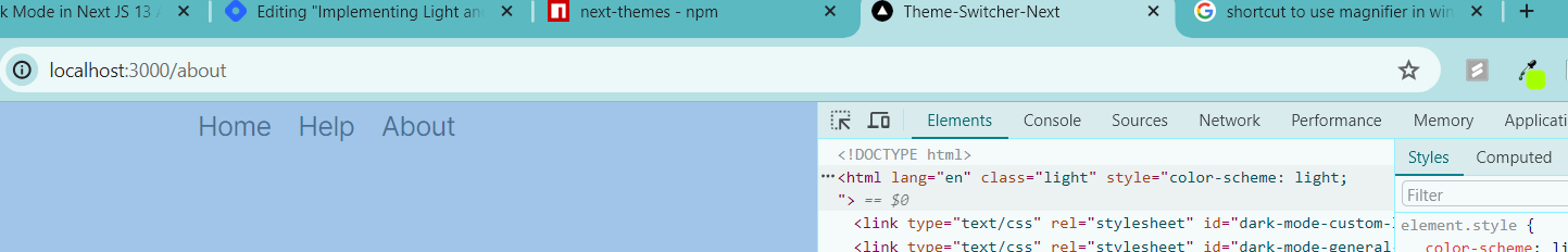
As we did in our react-project, next-themes supports data-theme attribute which you can verify in the html of the page you are viewing. You can add these styles in globals.css file:
@tailwind base;
@tailwind components;
@tailwind utilities;

*{
  letter-spacing:-0.025em;
}

[data-theme="light"]{
  body{
    background-color:white;
    color:black;
  }
}

[data-theme="dark"]{
  body{
    background-color:black;
    color:white;
  }
}
Or maybe, you might not change the file and go the Tailwind way.
Using TailwindCSS to customise styling
Okay lets follow these steps :
Add a small change to providers.js:
"use client"
import { ThemeProvider } from "next-themes"

export const Providers = ({ children }) => {
    return (
        <ThemeProvider attribute="class">
            {children}
        </ThemeProvider>
    )
}
We are just sending it a prop named attribute with the value "class". We will need it since we want to implement class based theming.
You will see the class attribute appearing now. Next we need to let Tailwind know that it needs to consider the class attribute for knwoing the current theme So move to tailwind.config.js and make the changes:
/** @type {import('tailwindcss').Config} */
module.exports = {
  content: [
    "./pages/**/*.{js,ts,jsx,tsx,mdx}",
    "./components/**/*.{js,ts,jsx,tsx,mdx}",
    "./app/**/*.{js,ts,jsx,tsx,mdx}",
  ],
  theme: {
    extend: {
      backgroundImage: {
        "gradient-radial": "radial-gradient(var(--tw-gradient-stops))",
        "gradient-conic":
          "conic-gradient(from 180deg at 50% 50%, var(--tw-gradient-stops))",
      },
    },
  },
  plugins: [],
  darkMode:"class"// this line is added
};
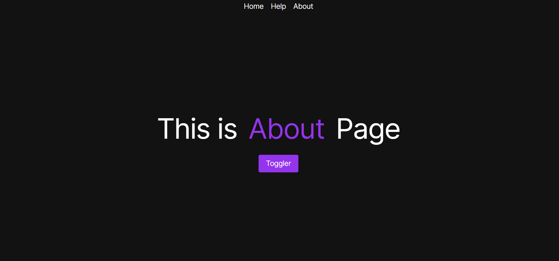
Now we are ready to give specific styles for dark mode. If you remember that in the react-project, I added a neon green color to the navbar links in dark mode. I will be doing just that here. By default they appear white in dark mode:
But lets make some changes in the Navbar component and give the neon color to the links in dark mode using tailwind.
app\components\navbar.js
import Link from 'next/link'
import React from 'react'


const Navbar = () => {
  return (
      <div className="navbar flex h-[5vh] items-center justify-center
          text-xl gap-5 dark:text-[#a6ff00]">
          <Link href="/" style={{textDecoration:"none"}}>Home</Link>
          <Link href="/help" style={{textDecoration:"none"}}>Help</Link>
          <Link href="/about"style={{textDecoration:"none"}}>About</Link>
      </div>
  )
}

export default Navbar
We added this line in the className of the main div dark:text-[#a6ff00] and it did its magic .
Similarly using dark: ...some tailwind styling you can get your desired result.
And thats it! You have successfully integrated theme toggling in your NextJS app and also applied customised styling using TailwindCSS.
Heres the live link: https://theme-toggler-next.vercel.app
Here's the code for this project.
Wrapping Up
It was quite a heavy blog but I hope you were able to understand it. And with that, thank you for reading and we will meet again!